Love the concept! Much more modern and eye catching. They should also scale down very well.
Few things you might want to consider:
- Still needs an indication that they are tools, otherwise they look like document icons.
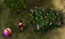
- The loathing map texture could be more interesting. In this iteration, it doesn't have the same visual impact as Fear's Soulblighter shot. Perhaps more contrast or more varied terrain might help?
- When the icons are very small, they will both be mostly green. This might make them hard to distinguish. Perhaps the screenshot of Soulblighter could be on a different terrain... Maybe rock or desert?
The texture map for loathing in the new icon simply does not have enough contrast to really show the river and stand up visually to Soulblighter's shot in Fear's icon.
Thus, I went through a bunch of colormaps and picked out portions that I thought would be interesting enough to fit the bill. I also shot them in such a way to allow for the hammer icon that you have recently added. As you can also see, I have resized them so that you can see how they look at the standard OS9 32px and 48px sizes.
My personal favorite of the four is the top left one. It most resembles the old Loathing and works the best at the small sizes. If a green one for loathing is used like this, then Soulblighter really needs to be on something other than green. I took a shot of him on the final level of M2 standing next to some lava. This puts him in the appropriate amount of contrast without being too busy. I also zoomed the camera so that his edges wouldn't alias. Because of this, his image would have to be scaled up to work at 128px.
Also the form of the hammer icon that you have recently added is good, but the color of the metal part of the hammer is too close in lightness to the image it is overlaying. Because of this lack of contrast, it would not work in lower icon sizes. The older icons used a light grey metal which contrasted quite well. Perhaps the new one could be similar?
Thank you for considering this and my previous comment. I really appreciate this kind of open process.
Edit: Cleaned up formatting, and a forum bug showing emoticons in the quote text.
Here's a preview of the icon's I've been working on. The Fear Icon I've actually been using for several months now. http://hl.udogs.net/files....ing.png
The only thing my eye doesn't like is the side of the hammer: it's too "flat" - needs a bevel of sorts, perhaps like so (I'm afraid I don't have PS here with me so must resort to an ASCII side-view!):
Graydon wrote:Here's a preview of the icon's I've been working on. The Fear Icon I've actually been using for several months now. http://hl.udogs.net/files....ing.png
Gosh, those look nice too. Maybe, once we are done, we should put this to a vote! I like the choice of images for the icons and the parchment motif fits with Myth and the rest of the program files. It doesn't look as clean as Taskman's modern motif though. It's just a matter of taste which is preferable I suppose.
I think the hammers on these are too small since most people don't have these icons scaled up all the way in their docks. Also, same as Taskman's, the hammers need to stand out more. Perhaps they should use a lighter grey and brown? I really like the realistic 3D look of the hammers though.
Soulblighter's picture for Fear looks great. It's really dramatic and catches the attention. Only problem I see with it is again, contrast. It works well with less contrast as in the large drawing that it came from, but small icons need to stand out. To increase the contrast the grey background should be much lighter or much darker. Also, Soulblighter himself could have increased contrast as well.
Only other thing I can think of is that the border shadow cast is a bit dark. If it was made 50% transparent and a bit less radius, it would look much closer to the parchment style in the rest of the newer Myth document icons.
I agree with your suggestions cuzog. They're not fine tuned yet, that's for certain. However, the black outline, i htink, will look rather good once it's not on a stark white background. The edge _does_ taper, but its harder to see, since you get all shades of the black, when its on a white background. If it were in your dock though, those tapered edges wouldnt necessarily be black in tint any more.
I agree that my hammers could be a touch bigger, however if you look at the original icons, my hammers are about correct in scaling.
Also, I have a feeling taskman might do graphic work professionaly ? I'm not sure. For the record: I dont. (Yet.)
Godz: Was your description of more beveled sides to me, or to taskman? Or both?
Duplicating doesn't seem to work! My cursor takes on the busy animation, I cannot manipulate anything else in Fear, and the duplicating never seems to end! (Well alright I didn't wait for longer than a minute.)