
ideas for graphical improvements
ideas for graphical improvements
some thoughts tossed around hl... to give it more of feel of the games and entice the surfer into discovering new maps and old.
if one does not learn from the failings of the past they are likely to suffer its return.

-
Death's Avatar
- Site Admin
- Posts: 1023
- Joined: Mon May 24, 2004 8:59 pm

well im looking at this from a lot of angles...
well im looking at this from a lot of angles... I could care less what the graphic was i just did those quickly though something graphical is needed to relate to the various myth games..... and the map above is an easy way to relate to all three..
myth tain etc.. need to be friendly to new players and a crisp cold look just doesn't work for that sure its fine for those already in the know and im sure the graphics as is are a code junkies wet dream though the concept really shouldn't be trying to be the next itain and myth surely isn't imyth its a game of strategy and kill or be killed.. and when looking at it from my background in art and advertising I simply think it has room for vast improvement, and ones that really arn't that difficult.
If this site myth was my client and my job was to create interest and sell product to new and existing clients....
1. I would one have the site clearly graphically link to myth realm... the map is one way of doing that up top...
2. the tain needs that tag line under it or somewhere stating its a myth game file archive...
3. each game should be headed up by more than just a simple icon... the headers are one way.. and certainly not the best and only way to do it grapically.
4. more items per page would be better...
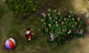
5. in map searches the best way to connect to players is through graphics. so if say each map uploaded its pregame 370x190 for the map description page that image could be resized to say 100x100 in one of the search menus as shown. as i show it there it also shows a resized tagset required. all these could easily be set up at time of map upload via a form that the uploader specs out... the images stored similar to avitars...
maybe all this doesn't matter, though I think it would help myths future.... I think its great that there is a tain at all so viva la creators of it.... though I'm 98.9% sure im right on these items so let the debate continue and in the end if some one takes the time to implement improvements great if not at least it exists in the first place.
myth tain etc.. need to be friendly to new players and a crisp cold look just doesn't work for that sure its fine for those already in the know and im sure the graphics as is are a code junkies wet dream though the concept really shouldn't be trying to be the next itain and myth surely isn't imyth its a game of strategy and kill or be killed.. and when looking at it from my background in art and advertising I simply think it has room for vast improvement, and ones that really arn't that difficult.
If this site myth was my client and my job was to create interest and sell product to new and existing clients....
1. I would one have the site clearly graphically link to myth realm... the map is one way of doing that up top...
2. the tain needs that tag line under it or somewhere stating its a myth game file archive...
3. each game should be headed up by more than just a simple icon... the headers are one way.. and certainly not the best and only way to do it grapically.
4. more items per page would be better...
5. in map searches the best way to connect to players is through graphics. so if say each map uploaded its pregame 370x190 for the map description page that image could be resized to say 100x100 in one of the search menus as shown. as i show it there it also shows a resized tagset required. all these could easily be set up at time of map upload via a form that the uploader specs out... the images stored similar to avitars...
maybe all this doesn't matter, though I think it would help myths future.... I think its great that there is a tain at all so viva la creators of it.... though I'm 98.9% sure im right on these items so let the debate continue and in the end if some one takes the time to implement improvements great if not at least it exists in the first place.
if one does not learn from the failings of the past they are likely to suffer its return.
Now I have to play Devil's Devil's Advocate... 
(looks like Point got his response in before mine - doh!)
When I come upon The Tain's home page, this is what I see:
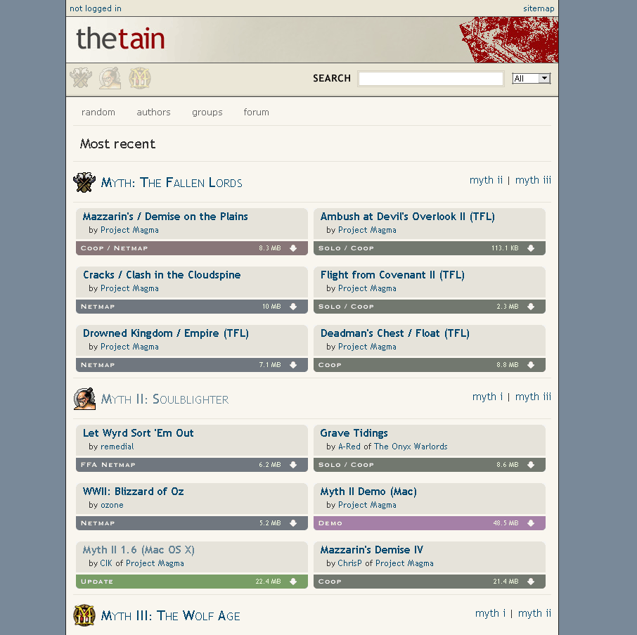
This looks great, but it also looks very homogeneous. It all looks the same more or less. I have to read through things each time to figure out what I am looking at. It all becomes a bit of a blur.
I realize now after reading the top that I am looking at "Most Recent", but until now I thought I was looking at a random sampling for each category (there are no dates on the entries which led me to this conclusion). I imagine when more entries are added it will look almost identical at first glance - in fact, I will most likely have to read the entries to determine if something has changed and determine for myself what has changed. Most likely I will be guessing.
Also from this front page, I don't understand what the "myth i | myth ii | myth iii" links are for since I am already looking at all three categories and clicking on them doesn't take me directly to those categories themselves, but only adjusts the page I am already looking at. In other words, they seem extraneous.
When I select the "Myth II: Soulblighter" link I now see "Latest 1-15 >>" and the word "Extras" on the right - not sure what "Extras" refers to? Might be nice to keep the "Myth II: Soulblighter" in front of "Latest 1-15" as the only indication (other than the page title) of what game I am looking at is the little soulblighter icon.
When I look at the list of the latest entries, I am again struck with the fact that entries look very similar. Is the icon on the left something that can be replaced with a small thumbnail the author can submit? This would be nice. If not, the icons don't convey any information to me.
Lastly, is there going to be a date listed on entries? I for one would like to be able to see the date of them to know if they are new and/or when they were done. Using the YYYY-MM-DD format is nicest for this since it also auto-sorts alphabetically (and allows for creations from the last century).
Again, this is all objective observation and meant as constructive criticism.
I for one am extremely pleased to have The Tain available at last!
(looks like Point got his response in before mine - doh!)
When I come upon The Tain's home page, this is what I see:
This looks great, but it also looks very homogeneous. It all looks the same more or less. I have to read through things each time to figure out what I am looking at. It all becomes a bit of a blur.
I realize now after reading the top that I am looking at "Most Recent", but until now I thought I was looking at a random sampling for each category (there are no dates on the entries which led me to this conclusion). I imagine when more entries are added it will look almost identical at first glance - in fact, I will most likely have to read the entries to determine if something has changed and determine for myself what has changed. Most likely I will be guessing.
Also from this front page, I don't understand what the "myth i | myth ii | myth iii" links are for since I am already looking at all three categories and clicking on them doesn't take me directly to those categories themselves, but only adjusts the page I am already looking at. In other words, they seem extraneous.
When I select the "Myth II: Soulblighter" link I now see "Latest 1-15 >>" and the word "Extras" on the right - not sure what "Extras" refers to? Might be nice to keep the "Myth II: Soulblighter" in front of "Latest 1-15" as the only indication (other than the page title) of what game I am looking at is the little soulblighter icon.
When I look at the list of the latest entries, I am again struck with the fact that entries look very similar. Is the icon on the left something that can be replaced with a small thumbnail the author can submit? This would be nice. If not, the icons don't convey any information to me.
Lastly, is there going to be a date listed on entries? I for one would like to be able to see the date of them to know if they are new and/or when they were done. Using the YYYY-MM-DD format is nicest for this since it also auto-sorts alphabetically (and allows for creations from the last century).
Again, this is all objective observation and meant as constructive criticism.
I for one am extremely pleased to have The Tain available at last!
...
Good ideas one and all, and I'm sure it's not meant as anything but constructive critiscism so if there's something the creator feels like adding or implenting then cool, but if not, then I still think no real harm done..
Yeah, I'm sure I speak for Myrd and TZ when I say all feedback is appreciated.
The tain is very much a work in progress (and has been for a long time!). I wouldn't be at all surprised to see some of these suggestions implemented at some point.
For now though, it seems the focus is on making sure everything is working smoothly and adding more functionality so be patient.
The tain is very much a work in progress (and has been for a long time!). I wouldn't be at all surprised to see some of these suggestions implemented at some point.
For now though, it seems the focus is on making sure everything is working smoothly and adding more functionality so be patient.
Some very good comments Baak. I agree that we can still improve this stuff a lot (and we have quite a few things planned, some of which address your points). I've just added so "Latest Items" page shows the name of the game.
Those are for users with lower resolutions, where the full list of items do not fit on a single page. The links jump to each of the other categories (on the same page).Baak wrote:Also from this front page, I don't understand what the "myth i | myth ii | myth iii" links are for since I am already looking at all three categories and clicking on them doesn't take me directly to those categories themselves, but only adjusts the page I am already looking at. In other words, they seem extraneous.
Very happy the Tain is up and running! Overall I am quite pleased there is a website for downloads, raw file lists for some reason just never quite made me want to download a file.
I think the comments above are pretty much on target, I can understand the appeal of banners, though more than one per page is overkill for anything shy of a setup where the viewer has a 42" plasma monitor with cable ISP. Some graphics to differentiate the maps would be nice - a smaller pregame or 100x100 advertising image might be good - if mapmakers or file submitters can add their own via html in the 'description' field that's probably workable though having a seperate field where submitters can enter pregame images and / or overhead maps or whatever would be nifty.
On the subject of graphics, if the pages are css skins or something similar, and the pages get more graphics intensive it might be nice for people with slow ISP connections (self-interest alert) to be able to select a 'skin' with minimal graphics (like the current Tain interface for ex) instead of having to wait for multiple images to load on every page.
All in all very good work on the tain, and kudos to all who worked on it!
Lots of Myth stuff at http://mythgraveyard.org.
Sometimes I put hard to find stuff in my my Udogs folder.
Sometimes I put hard to find stuff in my my Udogs folder.
M1 M2 M3 thoughts
A few last images for thought and discussion... utilizing a more myth related color scheme and clairifying the effect of the banner .


if one does not learn from the failings of the past they are likely to suffer its return.
-
Death's Avatar
- Site Admin
- Posts: 1023
- Joined: Mon May 24, 2004 8:59 pm
Mmmm those thumbnails do look nice...
A similar discussion of color scheme occurred on HL a while back with Gholsbane. The thing was that every myth site ever is earthtone. Which is cool and all since it is a very earthony game, but there is room for change in that.
I think The Tain does a very nice job of breaking away from that with its nearly gray blue borders, buttons, and text. I really like the color scheme as a whole as is...
EDIT: You can already have pictures in the description. Just do that, no thumbnails needed, they make it too crowded.
